



I work in spatial styling and collaborate with interior designers with regularity. Their most consistent challenge is not wall colour or lighting specification — it is the final layer: how to integrate plants in a way that makes the completed design come alive rather than simply complete. Here are five actual projects. No theory — direct observation, and the hard-won knowledge that comes from specific decisions made in specific rooms.
Case 1: Fintech Company — Too Much Technology, Not Enough Warmth — plant styling hong kong
Space: Commercial building in Central, 8,000 sq ft open office plus three meeting rooms. Style: Black, white, grey, metal, glass — the classic technology interior. Challenge: The client wanted “green elements” with a precise caveat from the outset: “do not make it look like a flower shop”
Designer Chan’s approach was to treat plants as sculpture, not softening. At the entrance: one Fiddle-Leaf Fig at approximately 1.8 metres including the pot, in a matte black metal planter with clean angular lines that echoed the geometry of the company logo. The Fiddle-Leaf Fig‘s broad leaves extend upward — the eye finds it on entry without being directed to it. It belongs so completely within the metal and glass of the surrounding space that removing it would be the stranger decision.
The open floor was more restrained: compact Snake Plants in white ceramic pots placed between each workstation. Viewed across the full floor, the regular vertical green lines read as design elements — deliberate repetition rather than scattered plants.
The three meeting rooms, all windowless, received Peace Lily in cement-grey planters. Peace Lily is one of the rare plants that does not protest a pure LED environment with visible deterioration.
Final result: The office retained its precision but ceased to feel clinical. The client reported that visitors’ first comment on arrival had become: “your space is so comfortable.”
Designer’s note: Fiddle-Leaf Fig at an entrance requires adequate light. This entrance had floor-to-ceiling glass along one face — sufficient for healthy growth. Without comparable light, the same plant will not survive the position.
Case 2: Creative Advertising Agency — Industrial Does Not Have to Mean Cold
Space: Revitalised industrial unit in Kwun Tong, 3,500 sq ft. Style: Exposed red brick, black iron pipes, cement floors — raw throughout. Challenge: Stimulate creativity without producing the atmosphere of a construction site in progress
Designer Lee’s instinct was contrast. Industrial ruggedness without any organic counterweight tips into warehouse territory. Plants were the balance — not softeners, but visual arguments.
On the exposed brick wall: three rows of black wrought iron shelving, each holding Pothos and Ivy trailing downward. Red brick, cascading green, black iron — three elements composing their own still frame.
The ceiling’s black iron pipes were wrapped in hemp rope, with several air plants fixed to them. No soil, no watering apparatus beyond a misting bottle — minimal maintenance, maximum visual surprise.
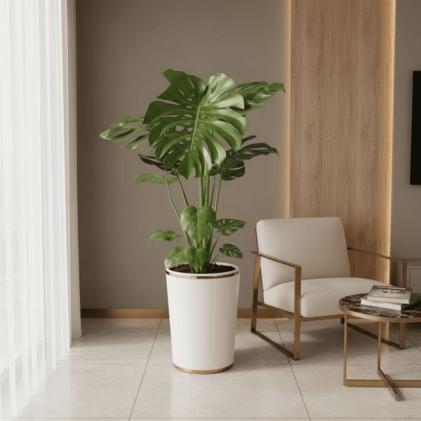
The open floor: two Monstera in vintage copper planters, in direct conversation with the iron pipes, brick walls, and cement underfoot. The Monstera‘s split leaves are among the most photographed plant forms of the past decade — their presence in the agency space generated a consistent stream of organic social media content.
The most considered detail: an old timber frame at reception, filled with a living moss board, air plants, and small succulents. Visitors assumed it was artwork until proximity revealed it was entirely alive.
Case 3: Law Firm — Symmetry as the Language of Authority
Space: Admiralty office tower, 5,000 sq ft. Style: Dark timber panelling, leather seating, marble floors — classical weight. Challenge: “Understated luxury” — plants that read as too casual would erode the professional register
Designer Wong’s key insight: law firms speak the visual language of symmetry. At reception: one Burgundy Rubber Plant placed on each side of the desk, matched as precisely as possible in height, canopy form, and leaf count. The planters were marble-patterned fibre clay — lightweight enough for the floor, visually indistinguishable from real marble. Two trees, balanced. Entering, the sense of institutional solidity is conveyed before any other element has been consciously registered.
The partner’s office moved in the opposite direction of scale — a single bonsai in a Japanese ceramic pot on the desk corner. Entirely restrained. Nothing performed.
The meeting rooms: Areca Palm in white fibre clay planters. The choice over other large plants was precise — Areca Palm‘s fronds extend upward and outward, and when viewed across a conference table, the sightline passes through the gaps between fronds rather than into solid foliage. A psychological boundary created without a physical wall.
Colour discipline across all spaces: deep green, lacquer-leafed varieties exclusively. No flowering plants. No mixed colour. No unusual forms. Professionalism is, in part, the discipline of restraint.
Case 4: Co-working Space — Designed for Everyone
Space: Near Central Market, 12,000 sq ft. Style: Nordic minimalism, light timber, predominantly white. Challenge: Users ranging from freelancers to multinational corporate teams — plants with universal accessibility and genuine character
Designer Cheung’s instinct was to give the plants a function people could engage with directly. In the open area: tall plant stands at approximately one metre, each holding trailing Pothos — functioning as spatial dividers with the permeability that partitions deny.
The pantry was the decisive move: mint, rosemary, thyme. Users could harvest leaves and brew their own infusions. In that moment, the plant ceases to be decoration and becomes an experience — particular, tactile, briefly restorative.
The entrance: a small plant wall with the company logo spelled out in different-coloured succulents. An organic photo point. No direction was required.
On maintenance planning:
Cheung designed for reality from the outset, selecting only self-sufficient varieties — Pothos, air plants. “A co-working space cannot have a dedicated plant keeper every day,” he said. “The plants need to know how to take care of themselves.”
Case 5: Medical Clinic — Warmth Without Compromising Clinical Integrity
Space: Mid-Levels family medical clinic, 2,000 sq ft. Style: White dominant, clean, requires calm rather than clinical atmosphere. Challenge: Medical environments demand rigorous hygiene standards; pure white induces anxiety in patients
Designer Ho’s principle was deliberate restraint. In the waiting area: one large Peace Lily in a white ceramic pot. Its white spathe and green foliage dissolve into the clinic’s white walls — the plant’s presence is registered below the threshold of conscious attention. Patients simply feel the room is less hospital-like. Which is the entire objective.
The examination room: one compact Snake Plant by the window. Tight space; nothing larger was viable.
The corridor: wall-mounted plant racks holding compact varieties in sealed-base planters, preventing any water contact with the floor during cleaning.
The treatment room: high-quality artificial plants. Treatment rooms require rigorous sanitation, and real plant soil and shed leaves constitute a genuine hygiene burden in that context. The boundary was drawn with precision.
The principle Designer Ho articulated for medical spaces applies more broadly than it might appear: “Plants must not create additional work for the cleaning staff.” Every subsequent decision followed from that.
Shared Principles Across All Five Cases Plants are an extension of brand personality — the forms chosen for a technology company differ from those appropriate to a law firm for the same reason the firms’ typefaces differ The planter is half the visual outcome — the plant provides the material; the planter provides the style and completes the argument Light assessment precedes every other decision — bring a light meter to the site; never estimate Maintenance access must be designed in from the start — plan for watering logistics and eventual repotting before the plants arrive Begin with one — even on the largest projects, test a single position first and extend from there
The One Principle Worth Taking
Pick the most visible position in the space — entrance, reception, main circulation route — and place a plant whose form and the planter’s material are in genuine dialogue with the character of the company. Not merely “matching colours” — ask whether that pairing says something true about who the company is.
A technology firm with a Fiddle-Leaf Fig in a matte black planter says: “we are precise, but we are alive.” A law firm with symmetrical Burgundy Rubber Plants in marble-patterned planters says: “we are solid, reliable, and the details are not incidental to us.” Plants have never been merely decorative. Positioned with intention, they are the most honest spokesperson the space has.
PlantShop understands the standards designers hold — not simply healthy plants, but plants capable of carrying the visual and atmospheric weight a considered space requires. We specialise in 130–180cm large potted plants, each hand-selected for form and leaf density, so what arrives on-site corresponds to what was envisioned. WhatsApp to arrange a selection appointment — a person assists directly. — PlantShop Horticulture Team
Related Products
Below are the plants mentioned in this article, available for direct purchase. Each comes with a real-person care card:



FAQs
Case 1: Fintech Company — Too Much Technology, Not Enough Warmth
Space: Commercial building in Central, 8,000 sq ft open office plus three meeting rooms. Style: Black, white, grey, metal, glass — the classic technology interior. Challenge: The client wanted "green elements" with a precise caveat from the outset: "do not make it look like a flower shop"
Case 2: Creative Advertising Agency — Industrial Does Not Have to Mean Cold
Space: Revitalised industrial unit in Kwun Tong, 3,500 sq ft. Style: Exposed red brick, black iron pipes, cement floors — raw throughout. Challenge: Stimulate creativity without producing the atmosphere of a construction site in progress
The One Principle Worth Taking
Pick the most visible position in the space — entrance, reception, main circulation route — and place a plant whose form and the planter's material are in genuine dialogue with the character of the company. Not merely "matching colours" — ask whether that pairing says something true about who the company is.
Related Products
Below are the plants mentioned in this article, available for direct purchase. Each comes with a real-person care card:
